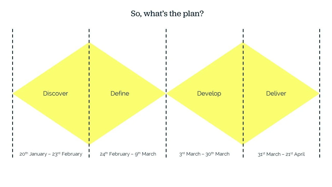
MA in User Experience Design project work
Roundabout website redesign
Website redesign for a local youth homelessness charity

Roundabout is a charity in South Yorkshire that supports young people who are homeless or at risk of homelessness,

I carried out research to better understand their website users and improve their site’s information architecture.

I produced a prototype of the redesigned website and documented my journey throughout the design process.
Discover
This part of the project involved gathering information to understand what problems existed and exploring how they might be fixed.

To explore the general public’s attitudes towards homelessness, I carried out desk-based research and small group discussions.
During the group discussions, I used Mentimeter. This is a tool that enables live meeting and webinar participants to anonymously respond to questions posed by the facilitator. This approach proved useful in gathering honest opinions about this potentially sensitive topic.
Identifying users
By combining data from Roundabout’s own website analytics tool with my own primary and secondary research, three key user groups were identified:
People who work or volunteer for Roundabout
People who are supported by the services Roundabout provides
People who support the charity through fundraising, donations or other awareness-raising activities
I focused on understanding Roundabout’s supporters, as this group’s engagement levels are the most likely to be affected by changes to the charity’s website.
This user group is likely to:
Live in one of Sheffield’s wealthy suburbs
Use their mobile phone to access the website
Care about local community issues
Lean left politically
I created a persona called Jackie to represent these users.
I created this image in FigJam as that was the tool I used throughout this project to record and organise ideas. I’ve extracted the text and put it into the accordion below.
-
Jackie moved to Meersbrook, a wealthy Sheffield suburb, in the late 1980s and has been very happy there ever since. She’s a mostly retired secondary school teacher with a husband, two grown-up children and a rescue dog.
As someone who is passionate about young people and her local community, Jackie wants to find out how she might be able to support a charity like Roundabout.
-
Jackie considers herself to be a ‘bit of a leftie’ when it comes to politics. She likes to demonstrate this through her support of local, independent shops such as Moonko.
Jackie cares deeply about people and sees the challenges that young people face through her perspective as a mum.
-
Jackie’s goals are to:
Stay mentally and physically active as she enters the next phase of her life
Give something back to her local community
Support young people who are not are fortunate as her own children
Meet people
-
Jackie needs to:
Find information quickly and easily via her phone
Understand how her support is making a difference
Feel valued in her efforts to “do her bit”
The current experience
Roundabout already had a website so I decided to start with identifying what was already working well and where improvements were needed.
To do this, I carried out usability tests on their existing site. The tests were conducted remotely via MS Teams with three participants. Each participant was asked to show how they would:
Find out information about the charity
Sign up to volunteer
Donate to the charity
I uised the think aloud technique during each task, encouraging participants to share their thought processes with me.

“There’s a big Donate button here”
(Participant 2)
What was working well?
The usability test insights I gained revealed that there were already a lot of positives across the website. These included:
A Donate button that was easy to find
There was a lot of useful information on the site
The current, targeted campaign was easy to see and understand
Participants felt a lot of goodwill towards the charity and were happy to provide personal information that they felt would help
“Why does it not link from here?”
(Participant 1)
What could we improve?
I also identified some areas that could be improved. These included:
Making the site quicker and easier to navigate
Editing down and separating out some of the large sections of text
Better consistency and more conventional presentation of hyperlinks across the site
Clarifying the donation process once users had selected the Donate button
Define
Using what we had discovered, I spoke to stakeholders at Roundabout to define where our focus should be and decide on our next steps.
During the Discover phase, we had uncovered two possible focus areas:
The donation process
The site’s overall information architecture (IA)
Together, we decided to focus on the IA because:
It was an area of UX I wanted to develop my knowledge of
We believed that focusing on the IA first would provide a good foundation to improve other aspects of the site at a later date
Workshop it
I arranged to meet with the stakeholders at Roundabout to present my findings so far and start working on their site’s information architecture. I encouraged them to brainstorm all of the content that should be on their site, using an activity called list it out. We then used affinity mapping to group items together.
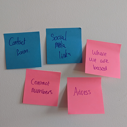
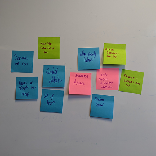
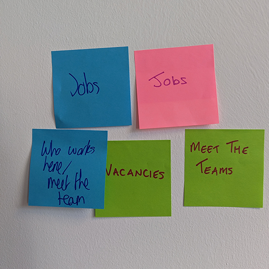
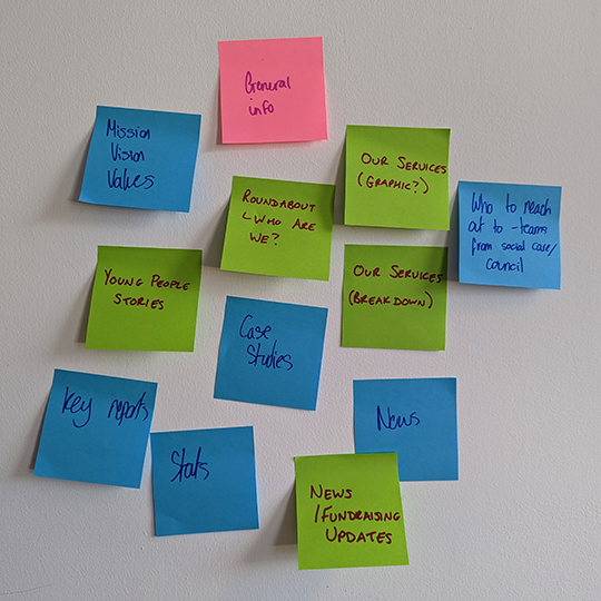
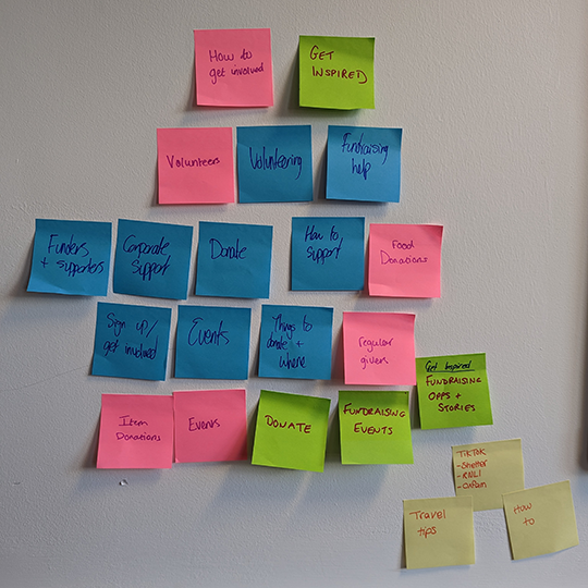
Card sorting
Using the content items listed out on the post-it notes, I created a card sort activity online. Each post-it note became a card. The purpose of this was to see how potential users would group Roundabout’s website content. How did it compare with the groups we had created in the workshop?
I conducted three rounds of card sorting.
The first was an open card sort, where participants created their own labels for the groups of content they had provided. This enabled me to analyse the groups of content and the language being used by participants.
For the second round, the categories already had labels. These labels were based on the words used by participants who took part in the first round. Participants were asked to organise the content into the categories I had provided.
Using what I learned from the second round, I refined the number of categories and the labels used to describe them. Participants were asked to organise the cards into the categories provided again.
I used the outcomes from these activities to inform how Roundabout’s website content could be structured. This became a starting point when I began sketching out the user interface.
Develop
This phase involves suggesting “different answers to the clearly defined problem, seeking inspiration from elsewhere and co-designing with a range of different people” (Design Council 2024)
Initial sketches
Harmonising the colour palette
Roundabout had an existing colour palette, consisting of a bright pink, lime green and cyan blue. I recommended developing the existing palette to include a neutral teal and a light grey.
Then, based on the primary + base + white approach, I created designs which used one of the original colours at a time, plus the teal and grey.


Illustrations and photos
Being located in and serving the population of South Yorkshire is an important part of Roundabout’s identity. It’s one of the characteristics that separates it from other homelessness charities and it’s something that appeals to supporters like those represented by the Jackie persona.
To emphasise this, I created illustrations of iconic buildings in South Yorkshire. I also included photos of buildings and other South Yorkshire landmarks throughout my designs.
These illustrations were used to create patreon-inspired “identities” for different levels of regular donation. I also used them as backgrounds to create texture and interest in white spaces.


Deliver
My designs went through several rounds of creating, testing and iterating before the final versions were delivered and submitted for assessment.
Iterate, iterate, iterate
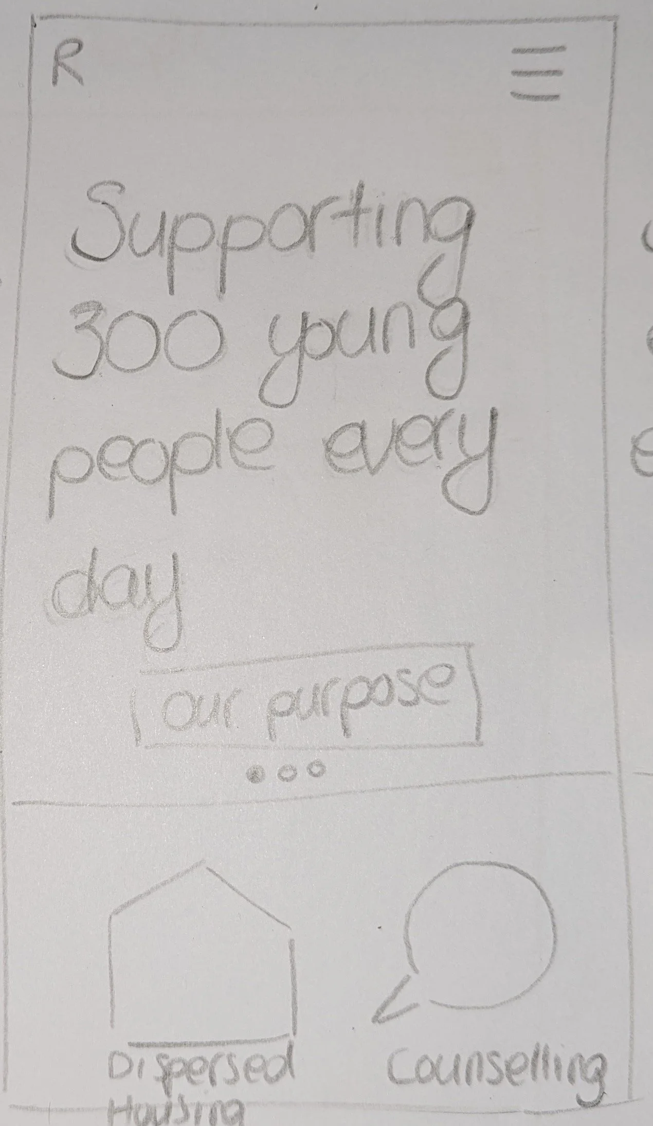
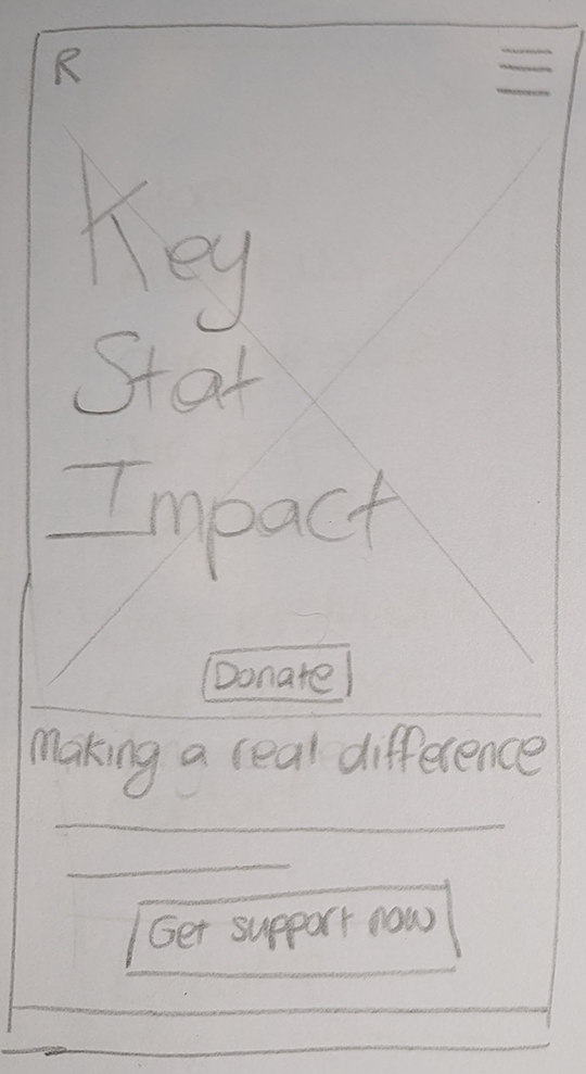
These images show some very early iterations of my home page design. One is a sketch, the other is the first version I created in Figma.
Reviewing these designs myself and testing them with potential users highlighted a number of areas needing improvement, such as:
Making the header text stand out more so that it’s easier to read
Refining the size and positioning of icon buttons,such as the menu and logo
Making the donate button more visible
Creating a more harmonious balance between the colours used
Reconsider the use of white for small font on the pink background

Final designs


Find out more
The assessment for this module included a critical reflective journal, presented in the format of blog posts. So if you found this case study interesting, the posts below provide more detail and reflection on each stage of the process.