Information architecture

As part of my MA in User Experience Design, I completed a module called UX Design.
This blog post was originally published as part of the reflective piece I wrote throughout that module.
Based on the user testing findings so far, my conversations with Roundabout to define the direction and scope of this project and the skills I’m wanting to develop on my MA, I’ve decided to focus on the information architecture (IA) of Roundabout’s website.
What is IA?
It’s more difficult to define than you might think. Morville and Rosenfeld offer some ideas though, suggesting that IA could be defined as:
“The structural design of shared information environments”
“The combination of organization, labeling, search and navigation systems within websites and intranets”
“The art and science of shaping information products and experiences to support usability and findability”
“An emerging discipline and community of practice focused on bringing principles of design and architecture to the digital landscape”
(2006:17)
For this project, I am going to be focusing on organising and labeling the content on Roundabout’s website and desigining its navigation systems. I’ll be thinking about “the structure to indicate to users where they can go and what they should expect when they get there” (Covert 2016).
Workshop with Roundabout
When I met the stakeholders at Roundabout to present my Discover stage findings and Define the focus going forwards, I decided to start looking at their site’s IA together.
Step 1: List it out
To get them warmed up, I started with an activity called List it out, an activity recommended by IDEO to generate ideas (Boyle 2020).
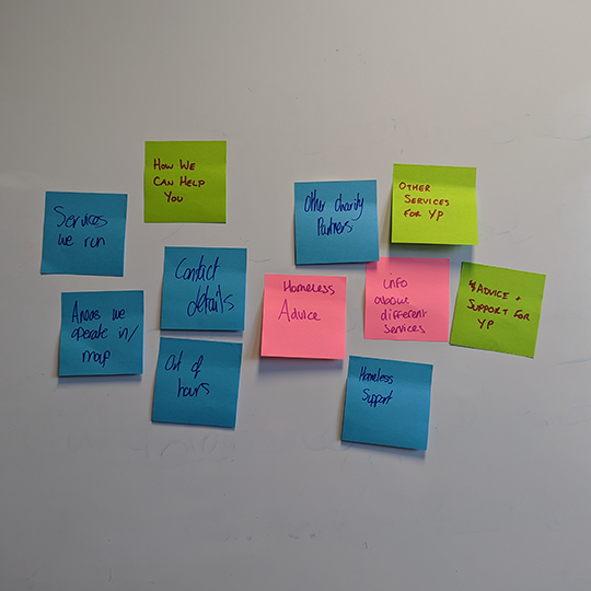
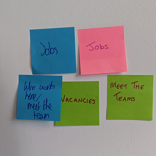
Each stakeholder chose a pad or sticky notes and a Sharpie in the colours they liked. I then gave them all three minutes to list things they thought should be on the Roundabout website, using one sticky note per idea. It got a little competitive!
When the three minutes were up, we put all of the sticky notes on a wall to see what everyone had written. Some information was duplicated across more than one sticky note. These duplicates were discarded.
Step 2: Card sort
According to Young, “designing something requires that you completely understand what a person wants to get done” (2008:13). The user flow I created based on the Jackie persona and scenario, involves navigating the Roundabout website to find information about the charity and “card sort exercises are one of the best ways to learn how your users would use information” (Morville and Rosenfeld 2006:134).
A card sort activity involves asking users to “organize topics into groups” (Sherwin 2018). So this is what we did, grouping sticky notes that seemed related together until we had five clusters of sticky notes we were happy with. We labeled these groups:
Contacts
Support
Vacancies
Services
Get involved


Reflections
What went well
I really enjoyed doing the activity in person because:
I liked how it affected the energy in the room
They all seemed to really enjoy it
It was much easier for me to show the value of this activity than to try and explain it
What could be improved
Having done a little more reading around card sorting, I realise that the activity I did with the Roundabout stakeholders was actually affinity mapping. Card sorting and affinity mapping are very similar. However, for card sort activities, the cards are “generally prepared in advance, although participants should be allowed to create their own while sorting” and they are a “semi-permanent artifact and can be used as a control over several exercises with different participants to find patterns among them” (Gray et al. 2010:74-75).
This nuanced distinction between the two types of activity didn’t change our ability to achieve the goal of categorising the website content. So in some ways it doesn’t matter that I called it a card sort when I should have called it an affinity map. However, it does make a difference when communicating what I did with my lecturers, peers and other UX professionals because using the term “card sort” doesn’t accurately describe to them the activity I carried out.
I carried out the affinity map activity with stakeholders from the charity who might not necessarily represent typical visitors to the organisation’s website. Doing this helped to illustrate what IA is to the stakeholders and gain their buy in for the project’s focus. However, I do need to develop a better understanding of more typical users.
Future plans
I plan to carry out a card sort exercise with users who are more typical of Roundabout website visitors. This will:
Clarify my understanding of the differences between card sorting and affinity mapping
Gather insights about users’ mental models of the website’s content
-
BOYLE, Brendan. 2020. ‘10 Activities To Generate Better Ideas’. IDEO U [online]. Available at: https://www.ideou.com/blogs/inspiration/10-activities-to-generate-better-ideas [accessed 31 Mar 2023].
CARDELLO, Jen. 2014. ‘The Difference Between Information Architecture (IA) and Navigation’. Nielsen Norman Group [online]. Available at: https://www.nngroup.com/articles/ia-vs-navigation/ [accessed 31 Mar 2023].
COVERT, Abbey. 2016. How does IA relate to User Experience? [Film]. Available at: https://aycl.uie.com/virtual_seminars/watch_intro/139/6 [accessed 21 Mar 2023].
GRAY, David, Sunni BROWN and James MACANUFO. 2010. Gamestorming: A Playbook for Innovators, Rulebreakers, and Changemakers. 1st ed. Sebastopol, CA: O’Reilly.
SHERWIN, Katie. 2018. ‘Card Sorting: Uncover Users’ Mental Models for Better Information Architecture’. Nielsen Norman Group [online]. Available at: https://www.nngroup.com/articles/card-sorting-definition/ [accessed 20 Mar 2023].

Thank you for reading.