Card sorting online

As part of my MA in User Experience Design, I completed a module called UX Design.
This blog post was originally published as part of the reflective piece I wrote throughout that module.
After demonstrating what a card sort activity is and how to do it during the define workshop with stakeholders from Roundabout, I repeated the same activity online with potential website users.
Finding a tool
There are a number of online card sorting tools available, including OptimalSort, CardSort tool and UXMetrics (Jain 2021). I chose to use OptimalSort because:
I didn’t have a lot of time to thoroughly research and review the tools available
OptimalSort was given as an example in the course content
One of my coursemates used OptimalSort and found it useful
It has a free version (and a free trial of the more expensive version)
Set up
I used the content written on the sticky notes by Roundabout’s stakeholders to create the cards in the online version of the card sort activity. This gave me 34 cards for participants to sort, slightly more than the 20-25 that Morville and Rosenfeld recommend (2007) but less than the 40-80 cards suggested by Sherwin in her article for Nielsen Norman Group (2018).
I wanted to understand:
How participants group content together
The language participants use to describe those groups
The most appropriate method achieve this is an open card sort. An open card sort allows participants to “create their own categories” and “label each of the categories they create” (Optimal Workshop 2023b). Another method is the closed card sort in which participants sort cards into pre-defined categories.
I created one pre-defined category as a space for participants to put cards that did not seem to fit anywhere else. The rest of the sort was open for participants to create and label their own categories. This made the card sort I created a hybrid between open and closed.
Participants
Given that this is a Masters degree project with no funding, I recruited participants using the resources I had access to for free. This included:
My own social media networks, including Facebook and LinkedIn
A discussion forum for the module I’m studying as well
Discord server spaces used to connect with other students on my course
The stakeholders at Roundabout also shared a link to the activity using their own LinkedIn accounts.
The activity was live for seven days and was completed by 22 participants.
Results
Categories
130 categories were created in total. The median number of categories each participant created was six.
-
"Get Involved"
About
About Donating
About Fundraising
About Roundabout
About the Charity
About the organisation
About us
About Volunteering
Activities
Contact
Contact / find us
Contact details
Contact Information
Contact us
Contacts
Current and News
Details
Donate
Donating food and items to Roundabout
Donating Info
Donations
Donor information
Engagement
Ethics
Event Management
Events
Events and Fundraising
Find out more
Fundraising
Fundraising and Volunteering
Get in touch
Get In Touch
Get involved
Get Involved
Getting Help
Getting in touch
Getting Involved
Getting involved
Help us
Helping by donating
Homelessness Advice
How to help
How to support
How we Help
How you can help
Impact
Important Contact Details
Info about the charity
Info/Questions
Information
Join our Team
Key Information about the organisation
Latest
Logistics
Looking for help
main
Mission, Vision and Values
Mission, vision and values
News
News & Results
News and Events
News and events
News and Updates
News/stats/impact of our work
Opportunities
Organisation information
Our Mission
Our services
Our Story
People worked with
Philanthropy
Professional and Corporate information
Roundabout Info
Roundabout's Stories
Service user information
Services
Sign up
Stories
Stories and Services
Support
Support Us
Support us - fundraising
The difference we make
Thing you need to know
Volunteer information
Volunteering & general donations
Volunteering and Jobs
Website Main Page(s)
What can I do?
What Roundabout do/different services
What Roundabout does
What we do
Who we are
Who we are and how we can help
Work with us
Working for Roundabout
Working with Roundabout
Youth Homelessness
A lot of categories have very similar names. For example:
Get in touch
Get in Touch
Getting in touch
All three categories essentially have the same name but are listed separately due to the slight variations in wording and formatting. However, this is useful in that it indicates that perhaps some variation of these words would be helpful as a menu item to aid navigation around the site.
Standardisation
Standardising categories merges categories with similar names together. This reduces the total number of categories and makes analysis easier. (Optimal Workshop 2023a)
I followed the advice given by Optimal Workshop in their support article about standardisation (2023a) when doing this. In that article, they warn against just identifying categories with similar names and standardising them without first looking at the cards placed in those categories to see whether users do, in fact, mean the same thing.
This is what I’ve tried to do in the image below.

The Agreement score shows how many participants agree with this grouping of cards in the new, standardised category. It’s 57% which, according to the Optimal Workshop article (2023a), is quite low. However, I can also see how frequently the individual cards appear in this new category. Out of the 11 cards in this new category, there appears to be a high level of agreement in the grouping of the following cards:
Contact details
Out of hours contact details
Contact form
Address
Contact numbers
Who to contact for what
The social media links card also has a fairly high level of agreement.
The following cards appear less frequently:
Locations Roundabout operates in
Places you can bring things to donate
Current job vacancies
Sign-up to get involved
This would suggest that while some participants would group these cards with contact information, there are most participants who would group them into other categories. So, as I standardise the categories, I plan to pay attention to where other participants have put these cards and the frequency with which they are placed into the same categories.
Language and labels
Another thing I’ve been paying attention to is the different words and phrases participants have used to label each category. Continuing to use the Contact category as an example, the word “Contact” was used more frequently than other, similar words/phrases such as “Contact us” and “Contacts”.
Language is an important part of information architecture (IA). It’s one of the ways that digital systems communicate with users, helping them to navigate sites or apps and know what to expect when they open up a page or document (Covert 2016). As someone with a background in writing content, this is an area of IA and UX more broadly that really interests me.
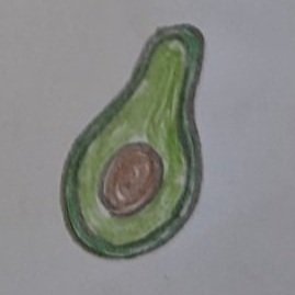
When creating labels for content, “information architects must try their best to design labels that speak the same language as a site’s users while reflecting its content” (Morville and Rosenfeld 2007:108). In the course content for this module, avocados are given as an example of understanding the users’ language. Technically a berry (Kew Gardens 2023) but due to its savoury taste, many shoppers think of it as a vegetable. So where should it be located in a supermarket? In the technically correct location with other berries? Or where shoppers are likely to look for it, with the vegetables?
I’ll need to consider the language used by the people who visit Roundabout’s website when I organise and label their content. However, this is not the only consideration.
Roundabout is an organisation with their own written style which includes their tone of voice and preferred words. This communicates who they are as an organisation and brand, as well as helping to reassure users that if they are looking for Roundabout’s website then they are in the correct place.
The language I use also needs to reflect Roundabout’s values and world view. For example, how might they feel about the word “inspire”? To some, it might feel like an engaging call to action. For others, particularly disabled communities, the word has more negative connotations (Young 2014).
This point reminds me of a blog post by Tom Albrighton of ABC Copywriting in which he analyses how “one little word makes a big difference” in comunicating a shift in Boots’ vision and values (2013). He comments that “the shift towards plurality aligns the slogan with the general trend towards socialness” but fails to reflect the more solitary experience of shopping at Boots.
So there’s clearly a lot to consider and balance when labeling content on websites:
Speaking users’ language
Reflecting the organisation’s tone of voice, values and world view
Helping users to navigate and find what they need
Next steps
The card sorting exercise has given me a lot of useful insights into how users would group and label the content on Roundabout’s website. However, I don’t feel like I have a clear idea of how to design the organisation, labeling and navigation (Morville and Rosenfeld 2007) of the site yet.
I’m curious about the IA of other charities’ websites. So, I think looking at those and doing a little competitor analysis would be a useful next step.
Reflections
What went well
I learned a lot about what card sorting is, different types of card sorting exercises and how to conduct this activity online. It’s given me ideas about how to organise the content on Roundabout’s website and a lot to think about in how that content is labeled.
What could be improved
Although 22 people completed my online card sort activity, this was only 36% of the total number of people who opened the link. Ideally, more people who opened the link would have also completed the activity. Having completed some card sort activities for my coursemates, I suspect one of the reasons for the high abandonment rate was the mobile experience of Optimal Workshop’s card sort tool. Dragging and dropping cards into categories, and then naming the categories was quite easy to do using a smartphone. However, it was very difficult to scroll down the list of cards as the vertical scrollbar was very small.
Future plans
I would like to try using another online card sort tool so that I can compare the quality of the experience from a participant’s perspective. In future, this will be an important factor in deciding which card sort tool I use.
-
ALBRIGHTON, Tom. 2013. ‘What a Difference a Word Makes’. ABC Copywriting [online]. Available at: https://www.abccopywriting.com/2013/06/13/what-a-difference-a-word-makes [accessed 21 Mar 2023].
COVERT, Abbey. 2016. How does IA relate to User Experience? [online video]. Available at: https://aycl.uie.com/virtual_seminars/watch_intro/139/6Links to an external site. [Accessed 21 March 2023]
JAIN, Abhishek. 2021. ‘7 Best Card Sorting Tools’. UXness [online]. Available at: https://medium.com/uxness/7-best-card-sorting-tools-6f05780f970a [accessed 20 Mar 2023].
KEW GARDENS. 2023. ‘Avocado - Persea Americana | Plants’. [online]. Available at: https://www.kew.org/plants/avocado [accessed 30 Mar 2023].
MORVILLE, Peter and Louis ROSENFELD. 2007. Information Architecture for the World Wide Web. 3rd ed. Sebastopol, CA: O’Reilly.
OPTIMAL WORKSHOP. 2023a. ‘Understand and Standardize Categories | Optimal Workshop | Help Center’. [online]. Available at: https://support.optimalworkshop.com/en/articles/2626879-understand-and-standardize-categories [accessed 20 Mar 2023].
OPTIMAL WORKSHOP. 2023b. ‘Choose between Open, Closed, or Hybrid Card Sorts’. [online]. Available at: https://support.optimalworkshop.com/en/articles/2626850-choose-between-open-closed-or-hybrid-card-sorts [accessed 20 Mar 2023].
SHERWIN, Katie. 2018. ‘Card Sorting: Uncover Users’ Mental Models for Better Information Architecture’. Nielsen Norman Group [online]. Available at: https://www.nngroup.com/articles/card-sorting-definition/ [accessed 20 Mar 2023].
YOUNG, Stella. 2014. I’m not your inspiration, thank you very much [Film]. Available at: https://www.ted.com/talks/stella_young_i_m_not_your_inspiration_thank_you_very_much [accessed 30 Mar 2023].

Thank you for reading.