Jackie’s user flow

As part of my MA in User Experience Design, I completed a module called UX Design.
This blog post was originally published as part of the reflective piece I wrote throughout that module.
What is a user flow?
“A user flow is a series of steps a user takes to achieve a meaningful goal.” (Handley 2018)
User flows are very similar to journey maps in that both techniques provide a visual representation of how a user would interact with a system to accomplish a specific task (Thalion 2019). For example, that task might be:
Logging into a banking app
Publishing a social media post
According to Hamm, it is “absolutely critical that we first map out the task flow and interactions the user will face” when designers are working on “complex website, web app, or other applications” (2014:28).
The difference between the two is that user flows focus on “actions to perform” only (Thalion 2019) and do not include any information about the users’ contexts, feelings or any other layers that might impact the experience of accomplishing the task. In doing this, user flows keep it simple and easy to understand the flow.
Journey maps do incorporate those additional layers of understanding, aiming to “detect pain points or moments of delight” (Thalion 2019). This does provide a broader, richer perspective of a user’s experience. However, in doing so, the picture becomes more complex and as a result takes more time to communicate and understand.
Jackie’s user flow
I created a user flow, based on the following scenario:
As a mum who wants to make a difference, Jackie is looking to support a local charity. She browses the Roundabout website to see if their values align with hers and find out how she could support them. She identifies ways to provide support and then either signs up or donates.

What I found most challenging and therefore interesting about the process of creating this user flow, was distilling all of the potential options into binary, yes/no, choices. I wanted to provide more details such as:
Explore top menu navigation
Listing the options available in the top menu
What the shapes mean
Shapes in a user flow diagram do not have to always follow the same conventions. However, they often do.
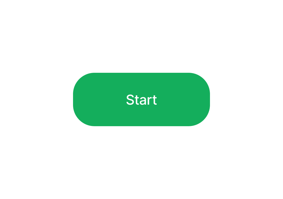
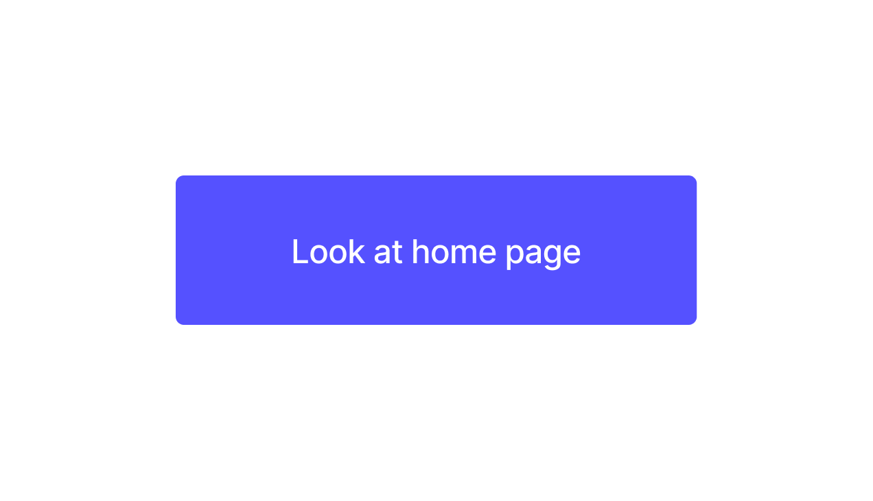
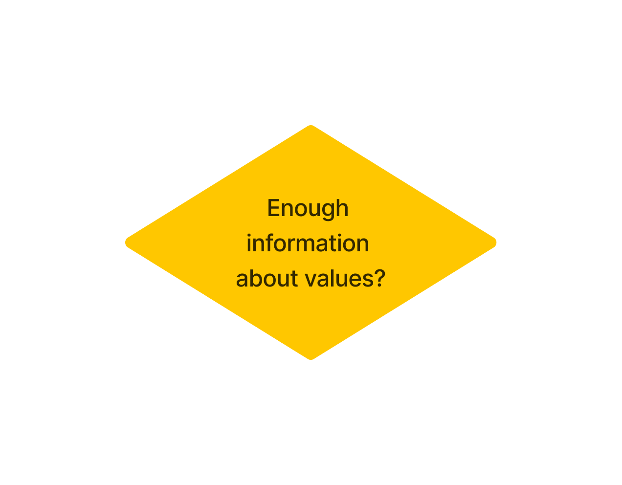

The legend here is based on the guidance provided by Hamm in his book (2014) however, they are very similar to the diagrams created by Thalion in their article too (2019).
Flow feedback
After creating this user flow, I posted it into a discussion forum for the UX Design module and received some useful feedback from one of my lecturers. He suggested that instead of snaking my user flow on the page, I consider presenting the main flow vertically down the page.
The user flow examples I had seen did snake on the page (Thalion 2018),(Hamm 2014) so I hadn’t considered presenting it vertically instead. However, his comment did make sense and I could see how this might make it easier to communicate to others. So I decided to try out his suggestion.
This is the same user flow, amended to follow my lecturer’s suggested layout.

This version includes all of the same information but it’s easier to follow and looks better. I’m really glad I shared the first iteration of the user flow in the discussion forum and I’m really grateful for the useful suggestions.
Reflections
Having created a user flow, here’s what I’ve learned.
What went well
The persona and scenario helped focus my attention and efforts on a single task for this user flow. Without that focus, I think I would have felt overwhelmed by the sheer number of possible journeys a user might take and the reasons they might visit a website.
Sharing my first iteration of the user flow on the discussion forum invited feedback from my lecturers and peers. This was really useful because I was able to use the feedback I received to improve and create something better. I’ll also use this feedback to inform the way I present user flows in future.
What could be improved
I was really happy with how this went and I’m not actually sure what I would improve. I would like to practice and build on what I’ve learned about user flows so far. I would also like to have a go at creating a journey map to see how two differ in practice.
Future plans
I plan to present future user flow diagrams vertically, like the second version I created.
I would like to carry out some user research to see how closely this user flow matches the way real users interact with Roundabout’s website and complete the same task.
-
HAMM, Matthew J. 2014. Wireframing Essentials: An Introduction to User Experience Design : Learn the Fundamentals of Designing the User Experience for Applications and Websites. Birmingham, England: Packt Publishing.
HANDLEY, Alexander. 2018a. ‘The Biggest WTF in Design Right Now’. Medium [online]. Available at: https://uxdesign.cc/the-biggest-wtf-in-design-right-now-87139f367d66 [accessed 9 Mar 2023].
THALION. 2018. ‘User Flows in Sketch — Step by Step Guide to Create Them Quickly’. Medium [online]. Available at: https://blog.prototypr.io/user-flows-in-sketch-step-by-step-guide-to-create-them-quickly-9dd130e0dd36 [accessed 9 Mar 2023].
THALION. 2019. ‘User Journey Maps or User Flows, What to Do First?’ Design + Sketch [online]. Available at: https://medium.com/sketch-app-sources/user-journey-maps-or-user-flows-what-to-do-first-48e825e73aa8 [accessed 9 Mar 2023].

Thank you for reading.